Unison Label
Role: Lead Designer
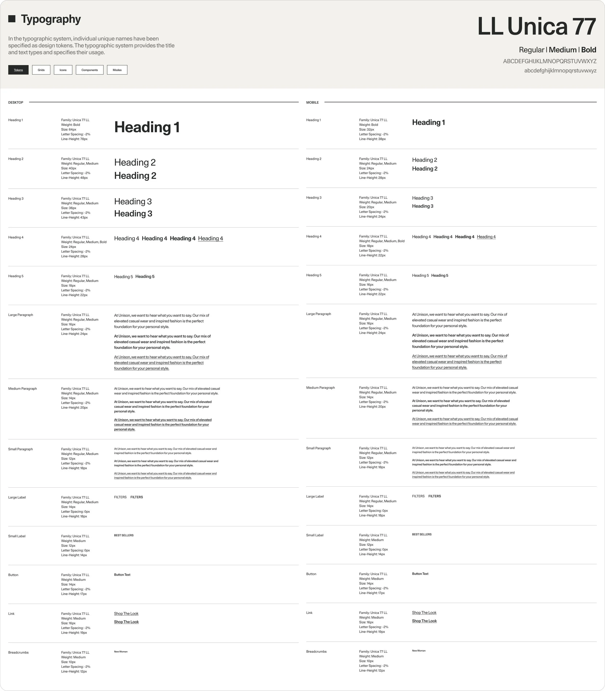
Design System
UI/UX
E-Commerce
Website Launch
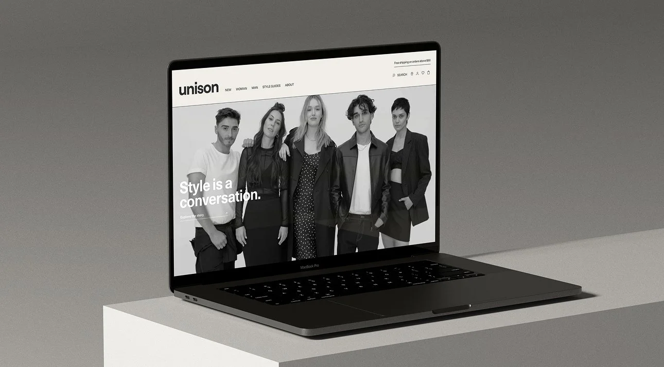
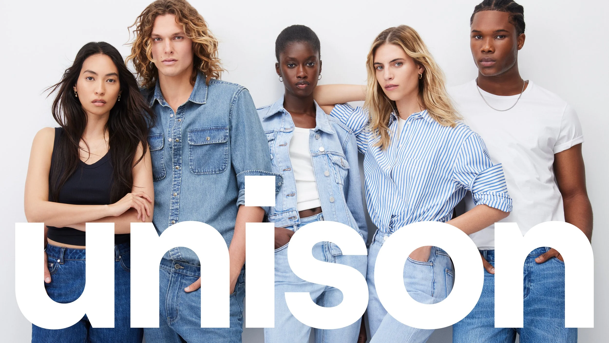
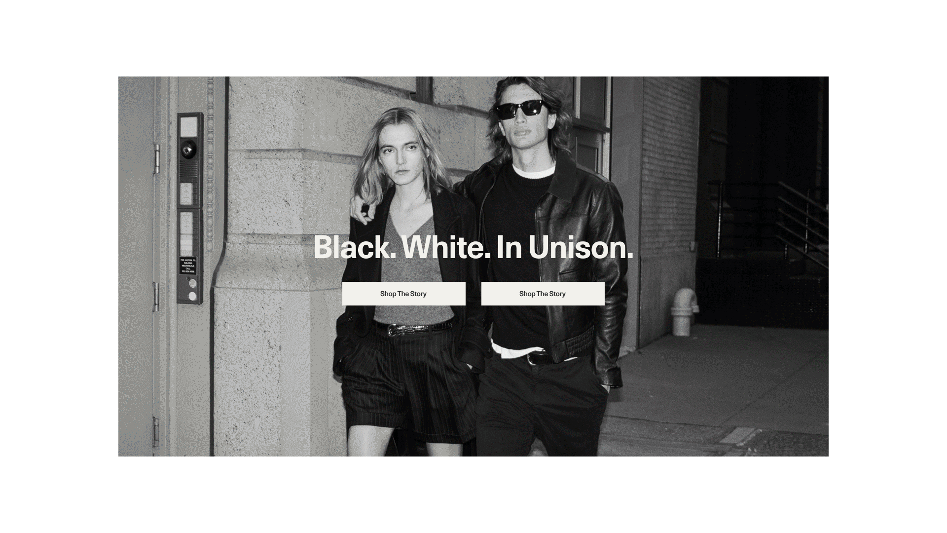
In August 2023, after more than two decades, iconic brand French Connection AU relaunched as Unison Label.

Brandbank’s decision to relaunch French Connection AU as Unison Label grew from the desire to fully shape the narrative as a unique and vertical Australian owned fashion brand. Allowing for greater opportunity to grow the brand, aligned with the company's own strategic vision. This meant moving from Salesforce to a whole new website on Shopify.
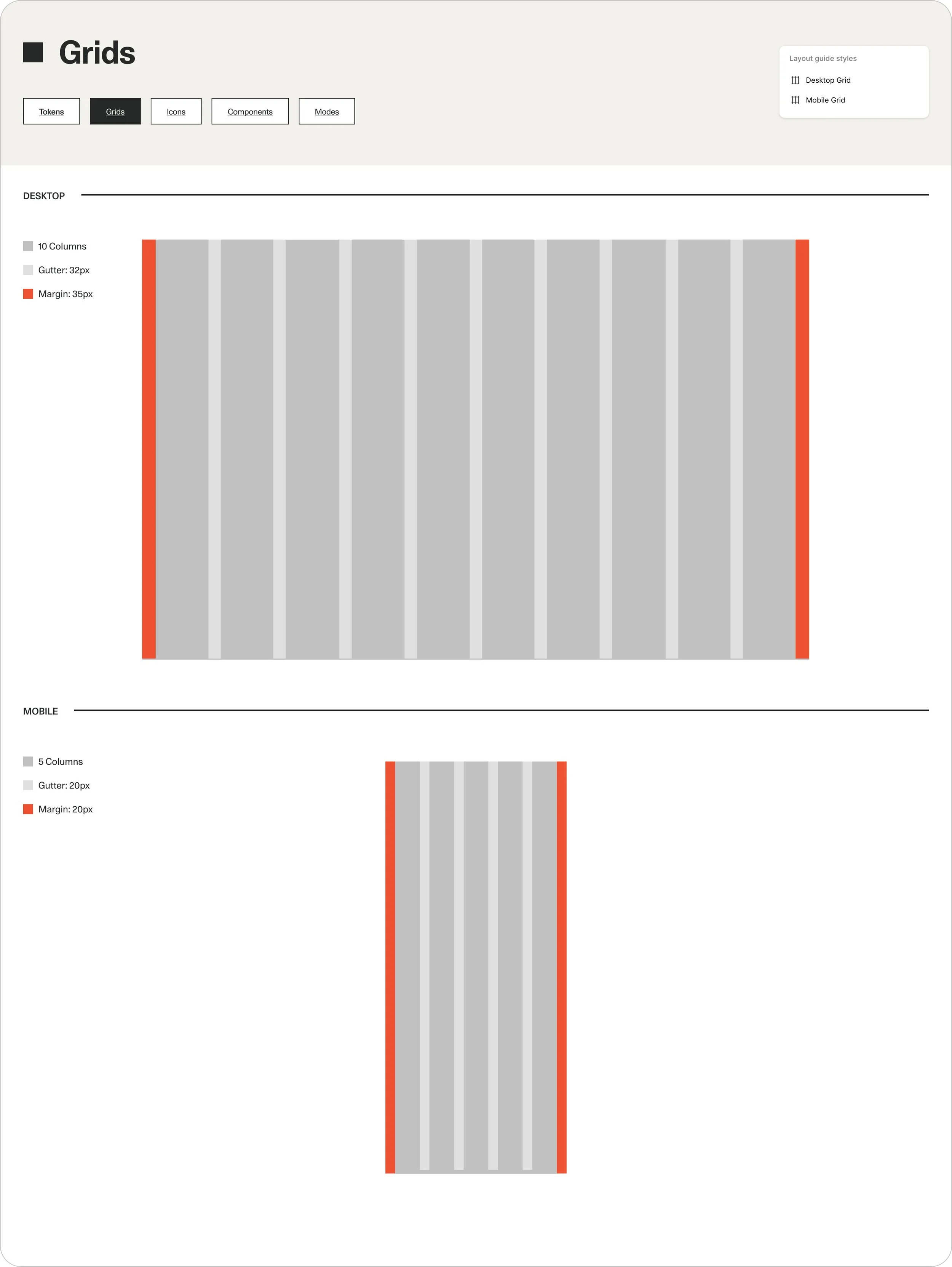
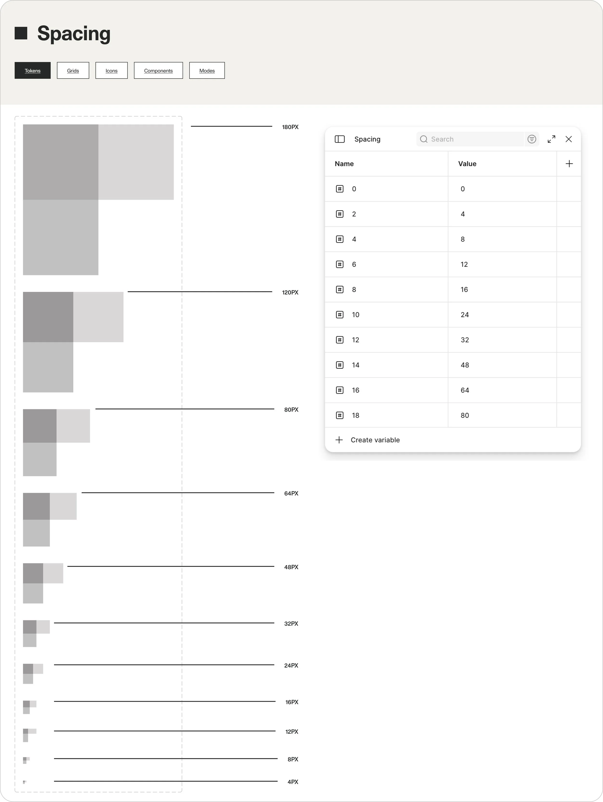
I led the UX design of the website, collaborating with an external branding agency, a fellow UX designer, and development partners to create a scalable design system comprising of new UI components, reusable modular templates, and the new brand style guide.
What I worked on:
01. Interactive Prototypes
02. High-Fidelity Wireframes/Mockups
03. Design System/Documentation for Developer Handover
04. Development/Design Testing
05. Content Site Migration
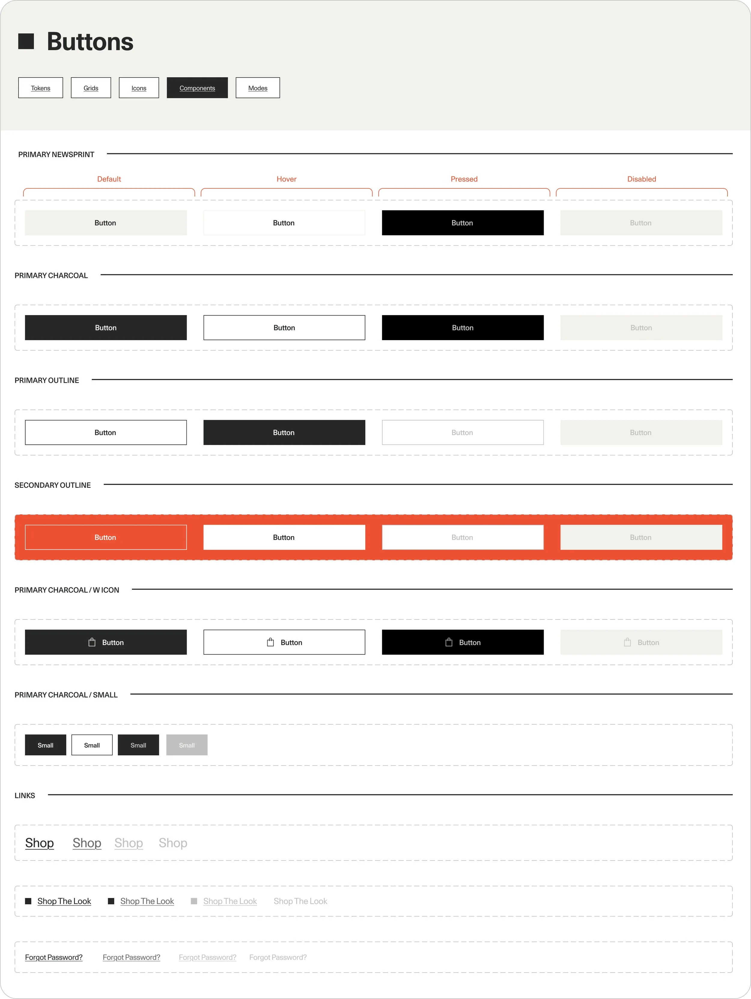
The Unison marketing team needed a high degree of flexibility to quickly create and iterate on campaign and content-driven pages without relying heavily on engineering support. To meet this need, we designed a scalable system of modular components that could be configured in multiple ways, empowering the team to build dynamic, high-performing layouts. This approach not only accelerated time-to-market but also ensured brand consistency, reduced development overhead, and created a foundation that could scale efficiently across the entire site.
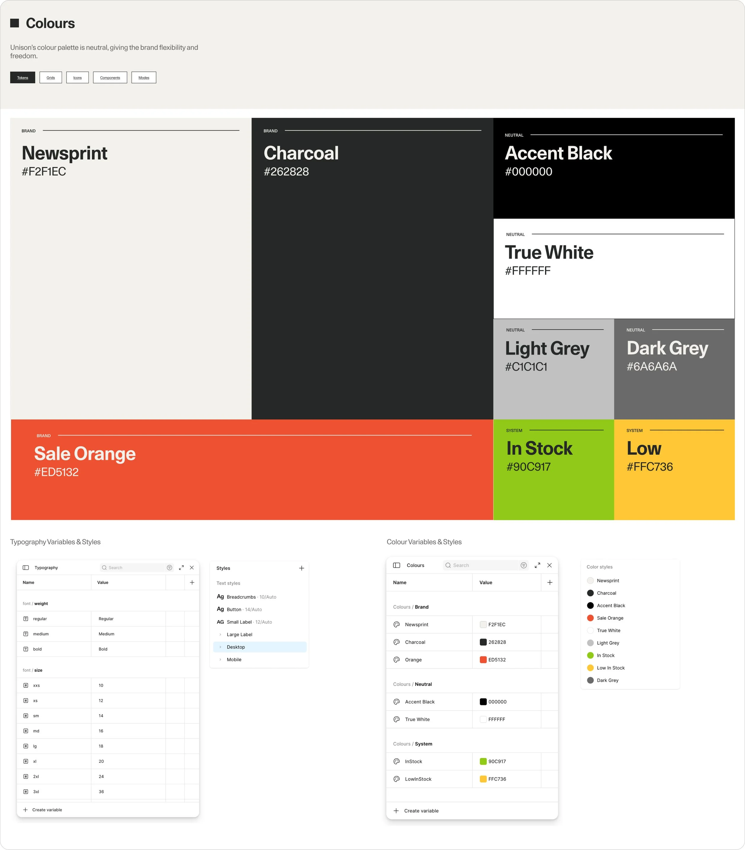
For further flexbility, led by the new brand identity - we also introduced three colour modes, using the brand colours - Newsprint, Charcoal, and True White; applicable globally or per page or module. Components were designed to adapt seamlessly across modes, maintaining readability, contrast, and brand consistency. This flexibility allowed marketing teams to tailor the site’s look and feel based on different campaigns, highlighting seasonal promotions or storytelling themes while keeping the overall experience cohesive.
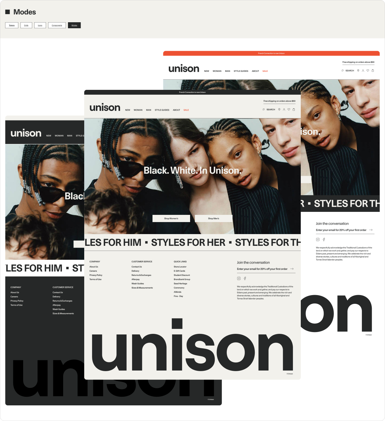

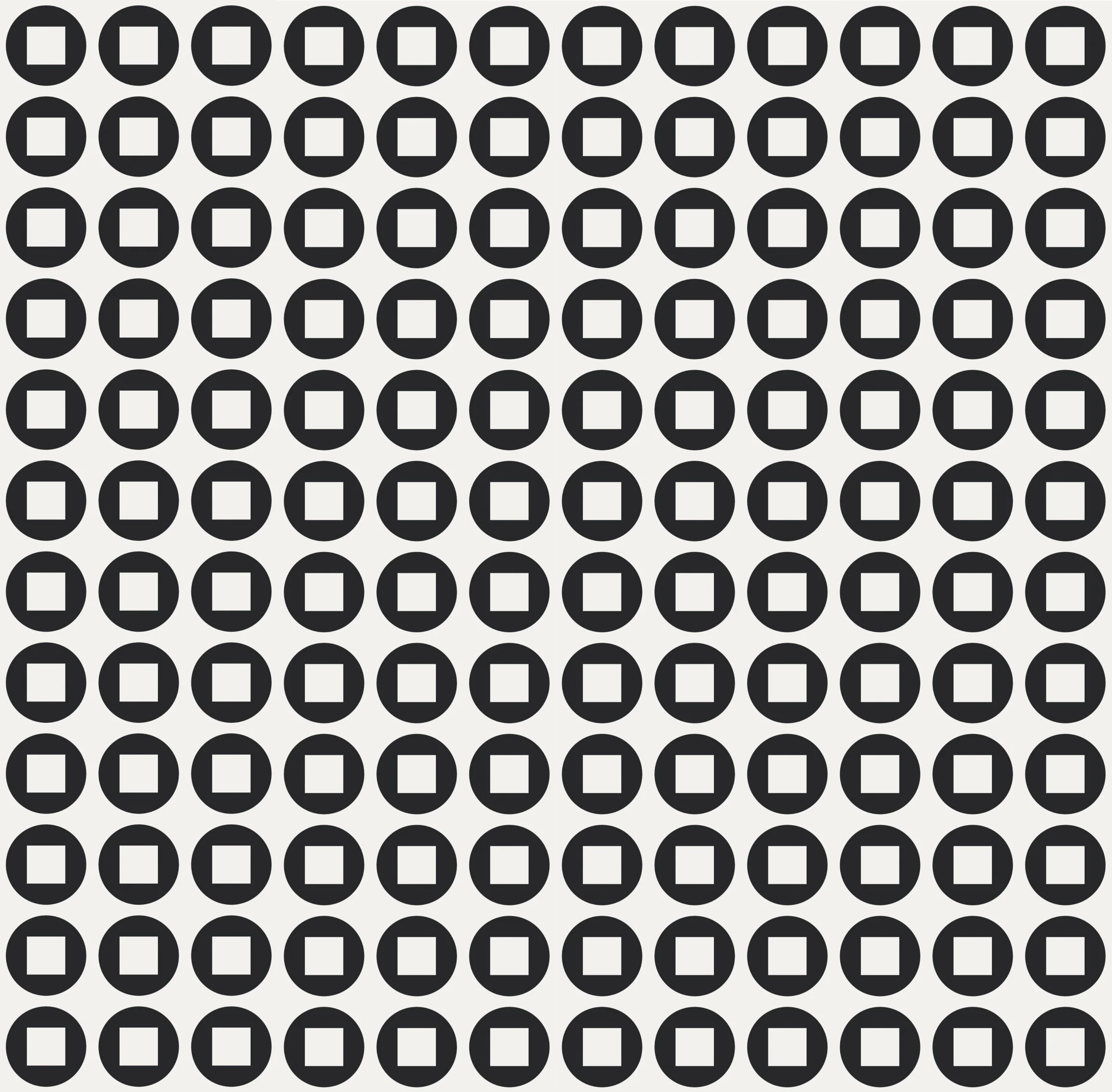
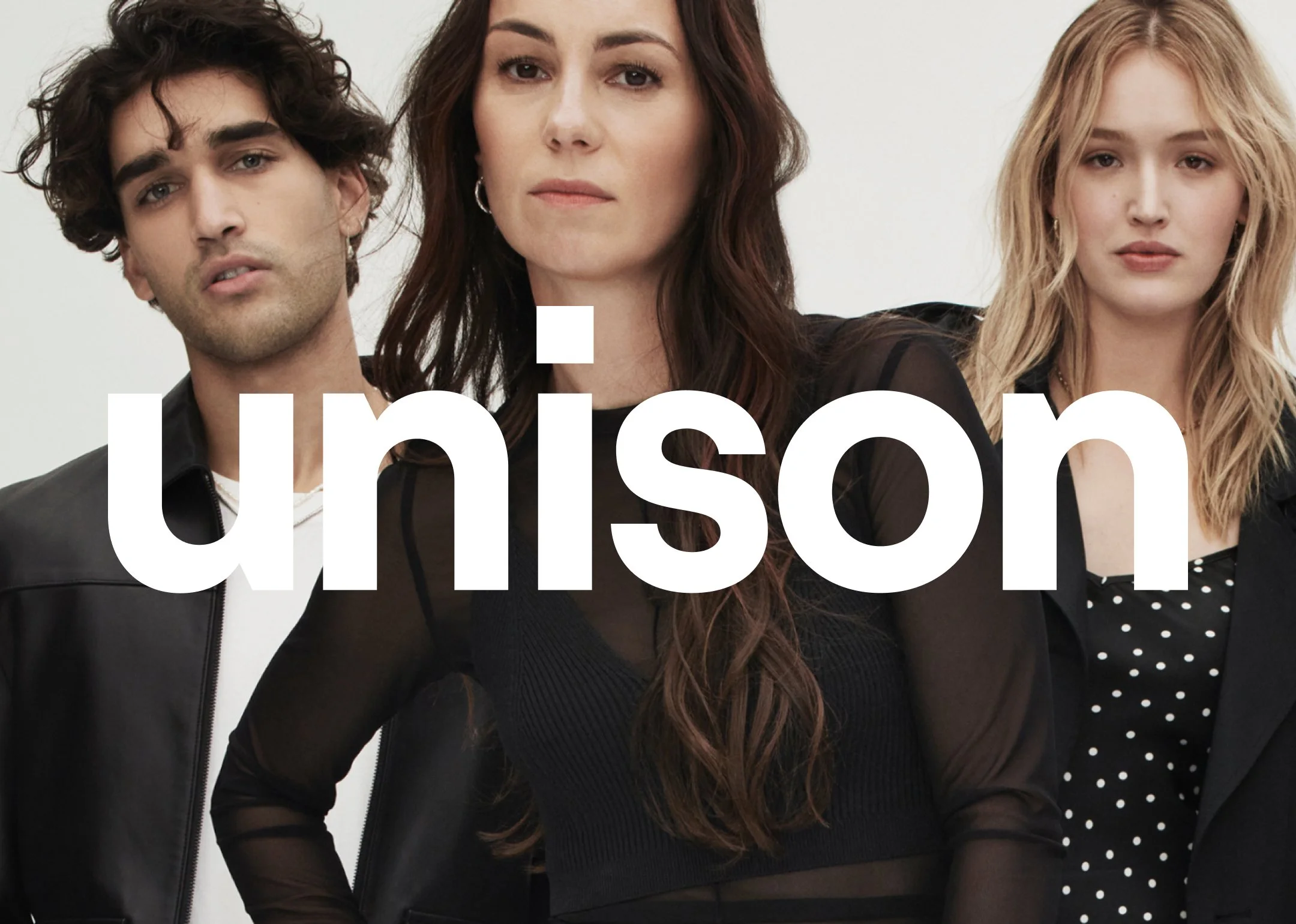
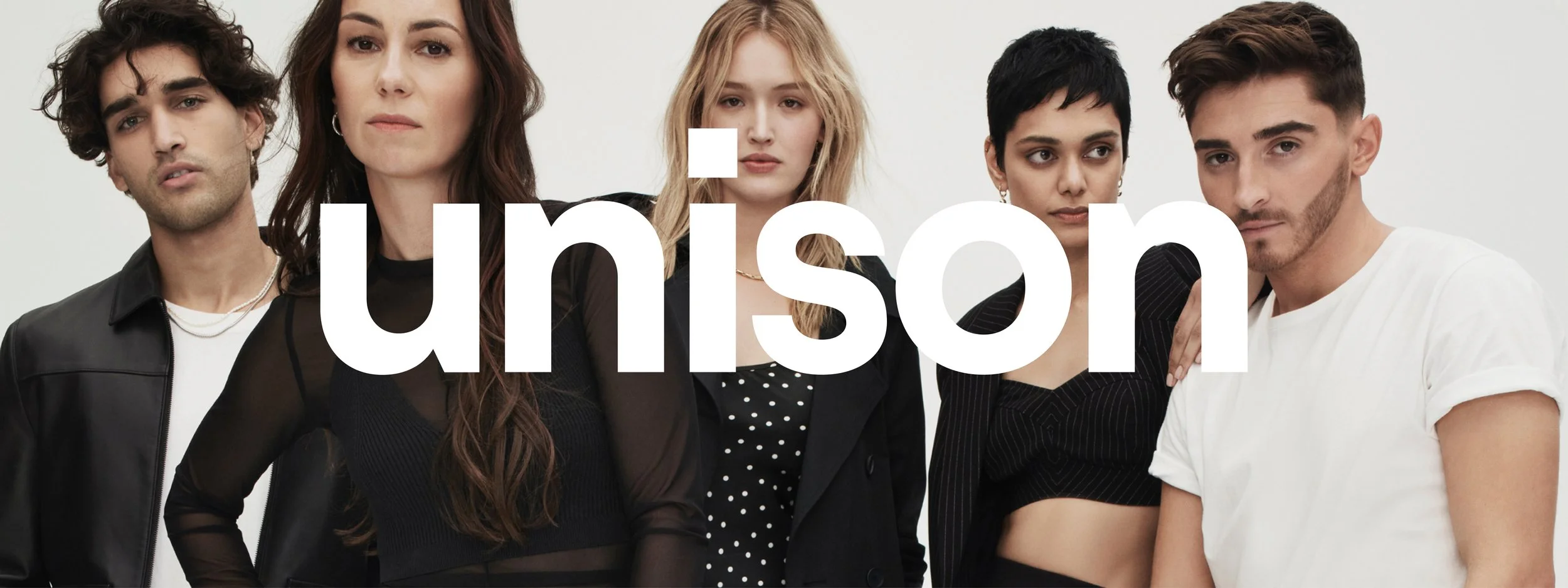
The Duality Mark which is highlighted as Unison’s central emblem, featured across clothing through to store activations and packaging heavily influenced the design direction of the website. This was done tactically through the square icon, predominantly used across key UI components across the site - merging brand and digital.
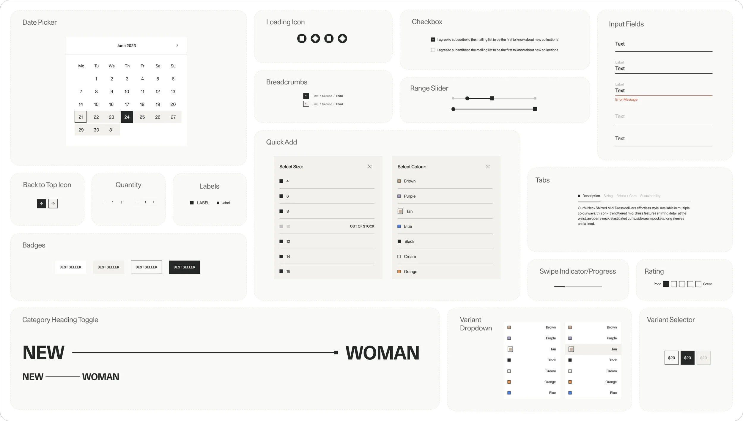
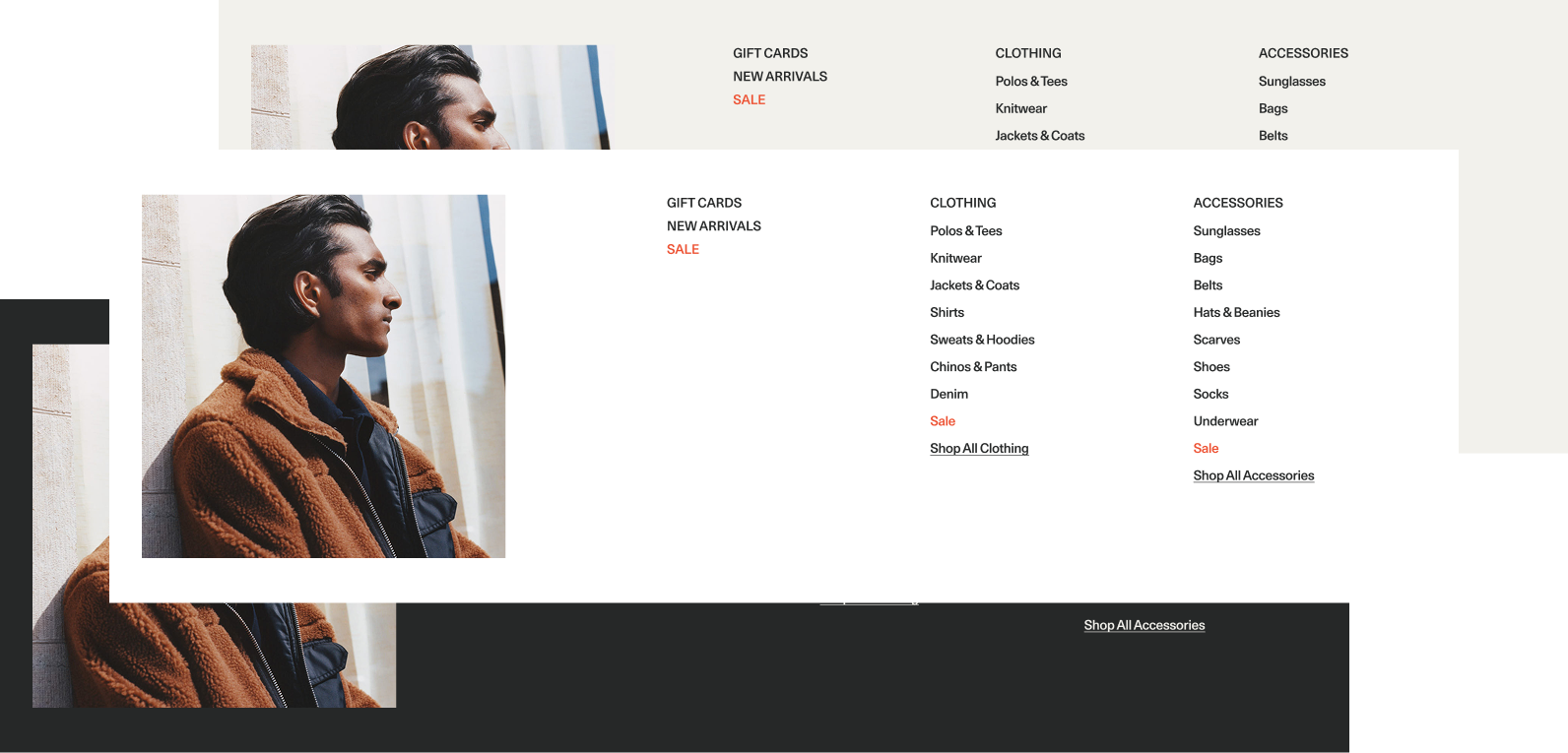
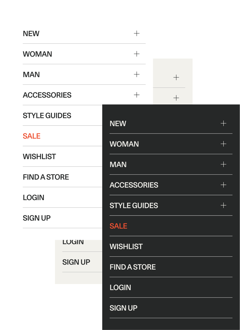
By applying atomic design principles, we structured the system from foundational elements through to complex components, ensuring consistency at every level. This modular approach increased scalability and allowed the team to build new experiences efficiently without compromising brand integrity.
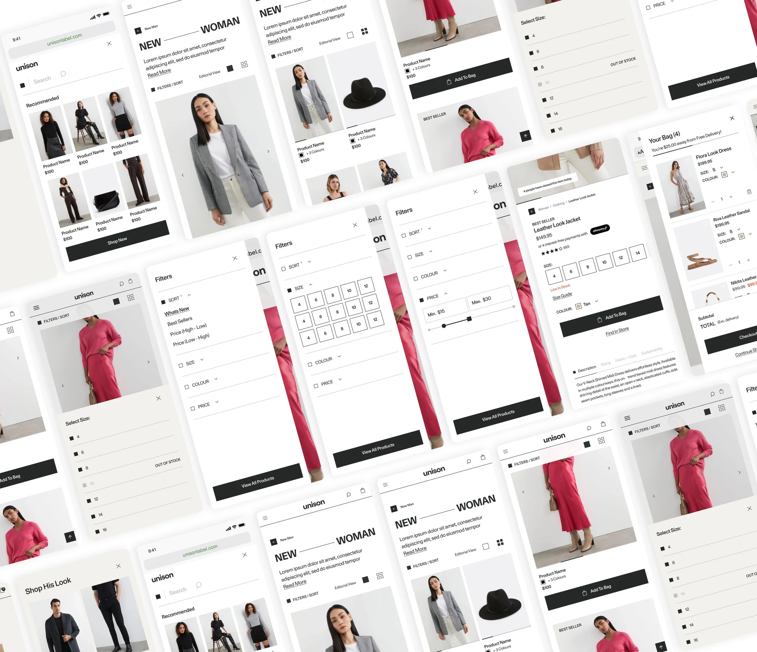
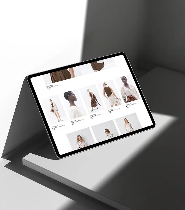
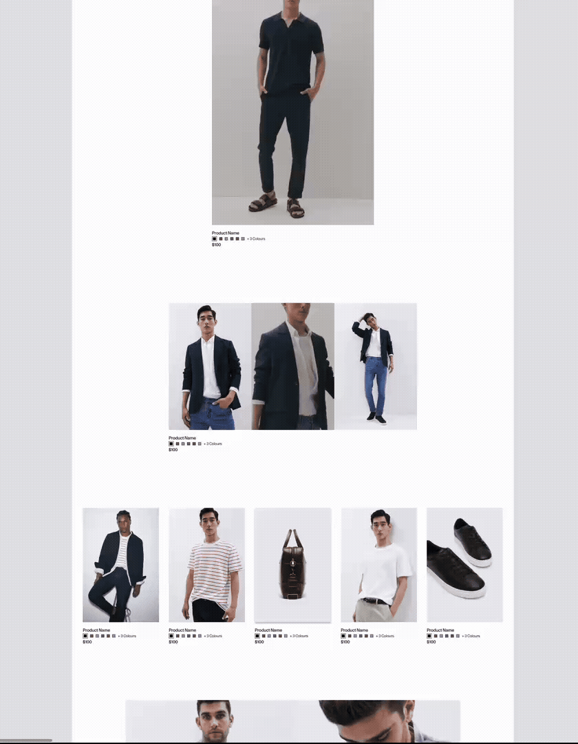
To elevate the shopping experience beyond a standard 4-col transactional product grid, we introduced an editorial view within the Product Listing Pages with the option to toggle between collections for Women & Men. For a fashion brand, inspiration is as important as functionality and our customers wanted to see how pieces are styled, layered, and worn in context.
This new view brought in opportunity to integrate campaign imagery and videos, curated edits, and styled looks directly into the PLP, blurring the line between lookbook and shop.
From a business perspective, this approach looked to increased engagement, support campaign visibility without requiring separate landing pages, and to create more opportunities to drive average order value through curated styling moments. Ultimately, the editorial PLP looked to transform the experience from browsing products to shopping a point of view.
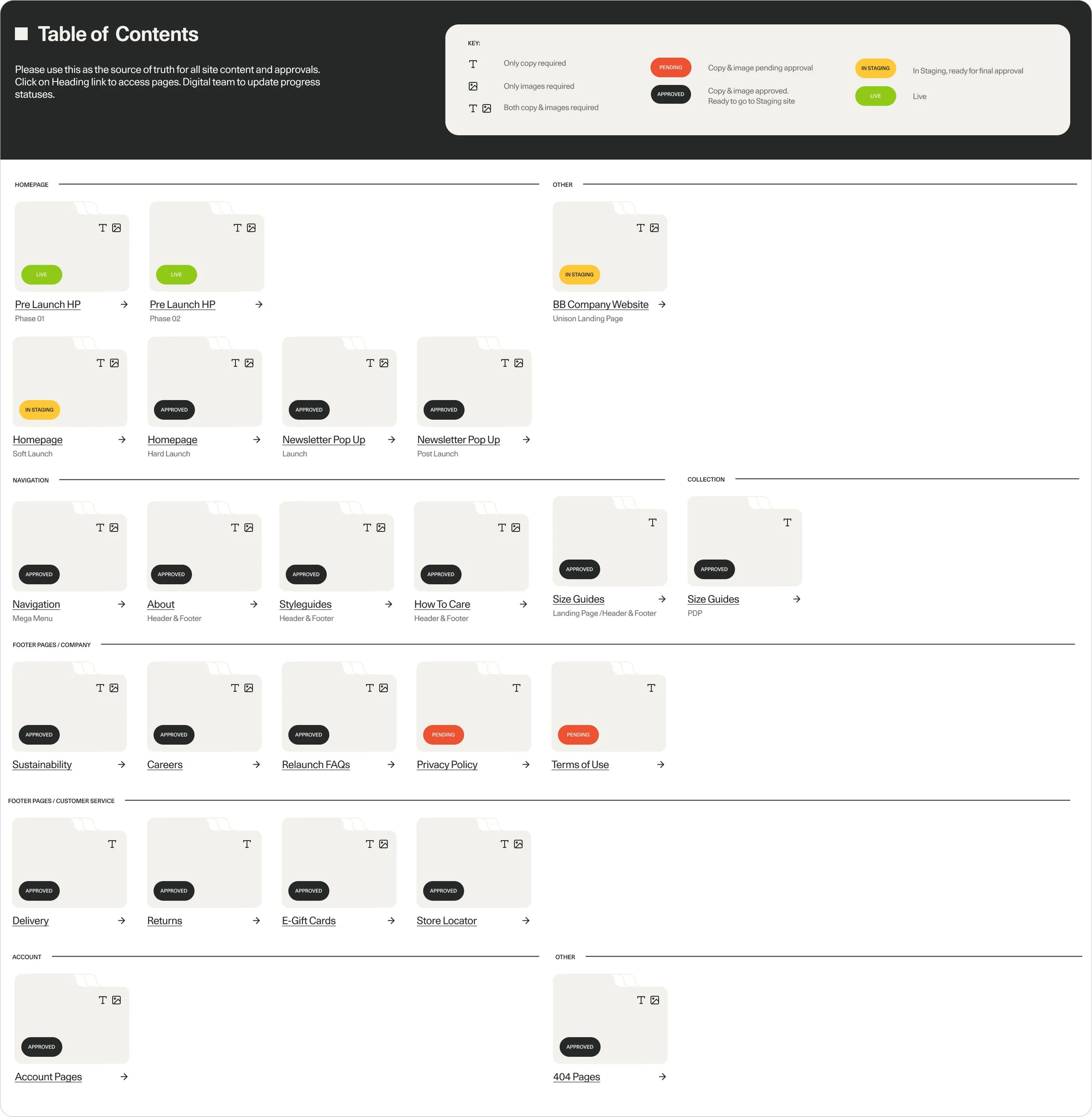
During delivery, I streamlined the transition from Figma to Sanity CMS by aligning modular design components with their backend counterparts, ensuring clarity, consistency, and minimal implementation friction. This was especially beneficial for the New Arrivals PLP Editorial View as this was manually curated.
I created a centralised, launch-ready Figma file showcasing all approved pages and components, giving stakeholders a clear pre-launch view and a structured space to finalise content. This enabled the Digital team to migrate approved content efficiently in batches, reducing bottlenecks and simplifying staging.
As a result, landing page production accelerated, approvals moved faster, and the team were set up for a smooth and confident go-live.
Overall, the launch of Unison’s website was a highly demanding project but ultimately a fun collaborative effort that brought upon lots of learning during the entirety of the project. The design system was built to allow plenty room for growth and I am excited to see how future design teams take, pick apart and expand it over the years to come.